Fix shift in axis in GraphScene #580
Conversation
When x_min or y_min were non-zero values the axis would shift and be separated. Now the axis should stay together.
|
Hi @Zarty55, thank you for your contribution! This is certainly a welcome fix. However, your changes broke some of the tests. Pinging @ManimCommunity/tests team to see if they can chime in. Note there is a possibility that your changes are correct and it is actually the tests that are outdated. Not sure at the moment. |
|
The test is failing but I think it's literaaly the test that has been outdated byt this change. |
|
Alright, I will try to check it probably tomorrow or during the weekend. I actually just noticed that this will not work anymore to display in the way most people will actually use (with the y axis in the middle, this change always places the y axis on the left). Maybe a better behaviour would be to check if the interval [x_min, x_max] contains 0 and if not then apply the shift to not have the axis be separated. |
Good idea! @Zarty55 : The script to test examples was repaired in #574 a few minutes ago, so make sure you pull the latest master before you start testing ;) |
|
Hello @Zarty55! Due to inactivity on this PR, I take over and finalize your fix. It turns out that this needed a little rewrite: instead of always shifting the axes to I've also added some (non-graphical) unit tests to check that everything is shifted correctly. Ready to review. |
|
Don't forget to update the changelog 😉 |
|
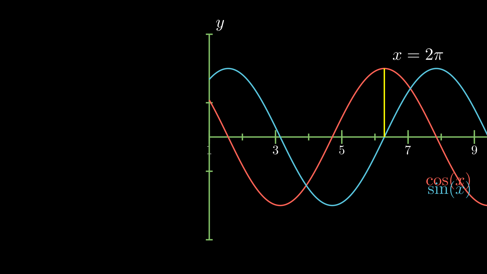
from manim import *

class SinAndCosFunctionPlot(GraphScene):
    CONFIG = {
        "x_min": 1,
        "x_max": 10.3,
        "num_graph_anchor_points": 100,
        "y_min": -1.5,
        "y_max": 1.5,
        "graph_origin": LEFT,
        "function_color": RED,
        "axes_color": GREEN,
        "x_labeled_nums": range(1, 12, 2),
    }

    def construct(self):
        self.setup_axes(animate=False)
        func_graph = self.get_graph(np.cos, self.function_color)
        func_graph2 = self.get_graph(np.sin)
        vert_line = self.get_vertical_line_to_graph(TAU, func_graph, color=YELLOW)
        graph_lab = self.get_graph_label(func_graph, label="\\cos(x)")
        graph_lab2 = self.get_graph_label(func_graph2, label="\\sin(x)",
                                          )
        two_pi = MathTex(r"x = 2 \pi")
        label_coord = self.input_to_graph_point(TAU, func_graph)
        two_pi.next_to(label_coord, RIGHT + UP)
        self.add(func_graph, func_graph2, vert_line, graph_lab, graph_lab2, two_pi)
|
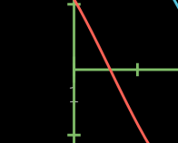
It took me a while to realize it: these strange lines are actually a 1 that is hidden below the y axis. 😄 |
Thanks for the reminder! Done via 9d38c7b |
List of Changes
When x_min or y_min were non-zero values the axis would shift and be separated. Now the axis should stay together.
Motivation
When graphing functions that are far off the origin point (0, 0) you normally whant to translate the origin. The original behaviour did not produce a satisfactory output because the axis were separated.
Explanation for Changes
Simply shifting each axis by -axis.number_to_point(min_val)
Testing Status
Checking this minimum working example:
Which produces this graph

Applying the changes we get
Which is much better. There is actually an error on the ticks of the y axis, it should be [0.25, 0.5, 0.75, 1, 1.25] but it seems to be rounded. I'm not sure if this is an error on my part, though.
Further Comments
This is my first pull request to any VCS ever, so if I made any mistakes please explain to me how to correct them.