are "Project description" or "Navigation" headers redundant? #3451
Description
When checking out the new pypi.org project pages, I noticed two small things that might unnecessarily consume valuable vertical screen real estate, so I thought I mention it here. (Screenshot from https://pypi.org/project/pygmsh/.)
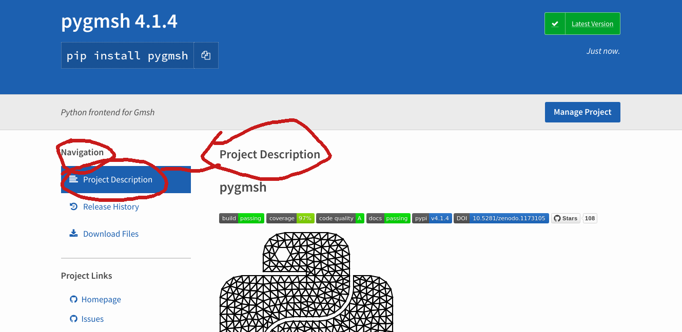
First off, the navigation sidebar says "Navigation". Is this really necessary?
The same goes for the "Project Description" header, with the same argument. I mean, obviously it's the project description. On top of that, the same wording is highlighted in the Navigation.
Removing both "Navigation" and "Project Description" gives more space to the actual content.
Third, I'm looking at the grey bar on the top. It's less obvious here, but it seems that one could save vertical screen real estate here by removing it. The "Manage Project" button could more into the blue and the short project description... Well, not sure.