Add SegmentedControl colors #329
Conversation
🦋 Changeset detectedLatest commit: 953c6e6 The changes in this PR will be included in the next version bump. This PR includes changesets to release 1 package
Not sure what this means? Click here to learn what changesets are. Click here if you're a maintainer who wants to add another changeset to this PR |
Variables changed--- base/dist/scss/colors/_dark.scss 2022-07-20 08:27:16.979139848 +0000
+++ dist/scss/colors/_dark.scss 2022-07-20 08:27:03.810871120 +0000
@@ -280,2 +280,6 @@
--color-switch-knob-checked-disabled-bg: #484f58;
+ --color-segmented-control-bg: #161b22;
+ --color-segmented-control-button-hover-bg: #30363d;
+ --color-segmented-control-button-active-bg: #21262d;
+ --color-segmented-control-button-selected-border: #6e7681;
--color-fg-default: #c9d1d9;
--- base/dist/scss/colors/_dark_colorblind.scss 2022-07-20 08:27:16.999140075 +0000
+++ dist/scss/colors/_dark_colorblind.scss 2022-07-20 08:27:03.834871645 +0000
@@ -280,2 +280,6 @@
--color-switch-knob-checked-disabled-bg: #484f58;
+ --color-segmented-control-bg: #161b22;
+ --color-segmented-control-button-hover-bg: #30363d;
+ --color-segmented-control-button-active-bg: #21262d;
+ --color-segmented-control-button-selected-border: #6e7681;
--color-fg-default: #c9d1d9;
--- base/dist/scss/colors/_dark_dimmed.scss 2022-07-20 08:27:16.987139939 +0000
+++ dist/scss/colors/_dark_dimmed.scss 2022-07-20 08:27:03.818871295 +0000
@@ -280,2 +280,6 @@
--color-switch-knob-checked-disabled-bg: #545d68;
+ --color-segmented-control-bg: #2d333b;
+ --color-segmented-control-button-hover-bg: #444c56;
+ --color-segmented-control-button-active-bg: #373e47;
+ --color-segmented-control-button-selected-border: #636e7b;
--color-fg-default: #adbac7;
--- base/dist/scss/colors/_dark_high_contrast.scss 2022-07-20 08:27:16.995140030 +0000
+++ dist/scss/colors/_dark_high_contrast.scss 2022-07-20 08:27:03.822871382 +0000
@@ -280,2 +280,6 @@
--color-switch-knob-checked-disabled-bg: #7a828e;
+ --color-segmented-control-bg: #272b33;
+ --color-segmented-control-button-hover-bg: #525964;
+ --color-segmented-control-button-active-bg: #272b33;
+ --color-segmented-control-button-selected-border: #9ea7b3;
--color-fg-default: #f0f3f6;
--- base/dist/scss/colors/_dark_tritanopia.scss 2022-07-20 08:27:17.007140166 +0000
+++ dist/scss/colors/_dark_tritanopia.scss 2022-07-20 08:27:03.838871732 +0000
@@ -280,2 +280,6 @@
--color-switch-knob-checked-disabled-bg: #484f58;
+ --color-segmented-control-bg: #161b22;
+ --color-segmented-control-button-hover-bg: #30363d;
+ --color-segmented-control-button-active-bg: #21262d;
+ --color-segmented-control-button-selected-border: #6e7681;
--color-fg-default: #c9d1d9;
--- base/dist/scss/colors/_light.scss 2022-07-20 08:27:16.939139393 +0000
+++ dist/scss/colors/_light.scss 2022-07-20 08:27:03.774870333 +0000
@@ -280,2 +280,6 @@
--color-switch-knob-checked-disabled-bg: #6e7781;
+ --color-segmented-control-bg: #eaeef2;
+ --color-segmented-control-button-hover-bg: rgba(175,184,193,0.2);
+ --color-segmented-control-button-active-bg: rgba(175,184,193,0.4);
+ --color-segmented-control-button-selected-border: #6e7781;
--color-fg-default: #24292f;
--- base/dist/scss/colors/_light_colorblind.scss 2022-07-20 08:27:16.963139666 +0000
+++ dist/scss/colors/_light_colorblind.scss 2022-07-20 08:27:03.794870770 +0000
@@ -280,2 +280,6 @@
--color-switch-knob-checked-disabled-bg: #6e7781;
+ --color-segmented-control-bg: #eaeef2;
+ --color-segmented-control-button-hover-bg: rgba(175,184,193,0.2);
+ --color-segmented-control-button-active-bg: rgba(175,184,193,0.4);
+ --color-segmented-control-button-selected-border: #6e7781;
--color-fg-default: #24292f;
--- base/dist/scss/colors/_light_high_contrast.scss 2022-07-20 08:27:16.951139530 +0000
+++ dist/scss/colors/_light_high_contrast.scss 2022-07-20 08:27:03.786870595 +0000
@@ -280,2 +280,6 @@
--color-switch-knob-checked-disabled-bg: #66707B;
+ --color-segmented-control-bg: #E7ECF0;
+ --color-segmented-control-button-hover-bg: rgba(172,182,192,0.2);
+ --color-segmented-control-button-active-bg: rgba(172,182,192,0.4);
+ --color-segmented-control-button-selected-border: #66707B;
--color-fg-default: #0E1116;
--- base/dist/scss/colors/_light_tritanopia.scss 2022-07-20 08:27:16.971139757 +0000
+++ dist/scss/colors/_light_tritanopia.scss 2022-07-20 08:27:03.802870945 +0000
@@ -280,2 +280,6 @@
--color-switch-knob-checked-disabled-bg: #6e7781;
+ --color-segmented-control-bg: #eaeef2;
+ --color-segmented-control-button-hover-bg: rgba(175,184,193,0.2);
+ --color-segmented-control-button-active-bg: rgba(175,184,193,0.4);
+ --color-segmented-control-button-selected-border: #6e7781;
--color-fg-default: #24292f; |
data/colors/vars/component_light.ts
Outdated
|
|
||
| segmentedControl: { | ||
| bg: get('scale.gray.1'), | ||
| hoverBg: get('neutral.muted'), |
There was a problem hiding this comment.
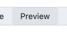
As I've been working on the React implementation of segmented controls (PR), I changed the design to make the :hover and :active states lighter.
I haven't solved the design for all color modes yet, but here's what I have so far: https://github.com/primer/react/pull/2108/files#diff-feb85d0e75c6e6596e095632632ccc668254e56b60a7bffb4189736358e96222R40-R46
There was a problem hiding this comment.
Currently this PR is using:
- hover:
alpha(get('scale.gray.3'), 0.2) - active:
alpha(get('scale.gray.3'), 0.4)which is double of hover.
It should already be lighter than in Figma and keeps it in the same tone (gray hue) as neutral.muted
:hover |
:active |
|---|---|
 |
 |
Also, I added a border for :active to give it some sort of "inset" look when pressed.
There was a problem hiding this comment.
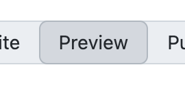
I kept the colors, but now it uses an "inset style":

|
@simurai - I'm going to collaborate with @vdepizzol and @langermank to come up with system-level color tokens that can be used for the segmented control. I'll keep you updated on our progress. |
|
It looks like it's going to be a while before we have the colors in the new primitives workflow (see the new Spacing and size and Typography tokens) |
So do you mean we should go ahead and merge this PR and try to replace these |
|
@simurai - yup, exactly |
This adds a few colors for the
SegmentedControlcomponent.Will be used for: