Display device names in front of device front/rear images #6960
Conversation
e90e815 to
40eb733
Compare
|
I like this very much, but if I understood your PR correctly you're changing the default layout from "images-or-labels" to "images-and-labels". Could we please retain the former default behavior? Each user is free to change the default for himself anyway. |
|
Thank you for your contribution, I like a lot. I've implemented it on my Netbox. Thanks!! |
|
@candlerb could you resolve the conflicts in |
d40e71e to
57e2298
Compare
|
Merged and passes |
|
I'm not sure it makes sense to use the device role color as the label "outline." It sems distracting and inconsistent with the rest of the UI. For the color to serve a purpose, it needs to have a substantial presence on the screen (e.g. as a solid block), which it doesn't here. IMO we should stick with white text and a black outline for all devices. Also, the four different combinations of image and label seem excessive. For example, I can't think of an instance where you would ever want to hide the text labels of devices that don't have an image. Three options would make more sense:
Devices without an image would always display their label, regardless of the selected view. A final minor point: If we're going to keep the pull-down selection widget, I think we should move it "inside" the content tab on the page, both in the interest of UI consistency and to better associate it with the rack elevations. |
Fair enough. That is, I'm assuming that you don't want white text with black outline when showing a label without an image, but to stick to the current behaviour (white text in front of dark colour, black text in front of light colour)
Let me try to clarify the terminology. Although you put "Images only" in that list, I think you're describing the option I called "Images or labels", which is also the current Netbox default. That is:
As it happens, that's the behaviour that I don't find useful, and indeed is why I started this PR. Labels generally represent the device identity. In a given elevation, I either want to see them or not see them. Hence the following were the ones that made sense to me, using the names that I implemented in this PR:
The current "images or labels" behaviour means that you get a mix of some devices with labels, and some without labels, based on on the fairly arbitrary criterion of whether the device type has an image or not. What happened was: as I started adding images to certain devices types, I started losing some of the labels in my rack elevations, and that was very annoying. However, that won't cause me a problem going forward because I can use "Images and labels" instead. So in summary: what I think you want is:
Is that correct?
I'm not clear what you mean here. There are two places that elevations are shown:
Can you be more specific where you'd like to see it moved in both cases? |
57e2298 to
745849f
Compare
|
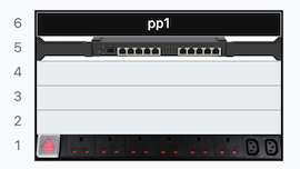
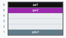
I have modified the rendering to use white-on-black in front of images, and to give the three options requested. I have not moved the position of the selector widgets though. Images and Labels
Images only
Labels only
|
745849f to
968bcf8
Compare
|
One issue I've noticed is that if you click the "Download SVG" button you always get the "Images and Labels" view, regardless of what you selected in the dropdown. This was the already case for Netbox previously: i.e. even if you'd selected "Hide images" you'd still get the SVG with images. The button links directly to e.g. I'm inclined to leave as-is, except that it might annoy people who want to the download view to be the same as before. We could statically add |
968bcf8 to
eb9f2b3
Compare
Yes, that's it. What you have in the PR currently works for me. Thanks!
Yes, sorry. I was referring to the individual rack view. I think it's fine as-is in the elevations view. I may tweak the selection list placement in the rack view, but I don't think it's a blocker for merging this PR.
Agreed that we can leave this as-is for now. (The user at least has the option of taking a screenshot in the browser.) I think it would be worth extending RackElevationSVG to include this functionality, however I'd like to do some cleanup work on that class first. I'm going to proceed with merging this as-is. Thanks for all your work @candlerb! |
Fixes: #6879 (for Netbox v3)
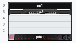
This replaces the hide images / show images toggle with four options from a select:
Images and Labels
Images or Labels
(This is the same as the current Netbox default)
Images only
Labels only
(This is the same as the current Netbox setting "hide images")
Notes
I am not a front-end programmer; both the typescript and the bootstrap styles need checking.
The typescript appears to work, but I've been unable to work out what command to run to get the the code type-checked. (
yarn bundle:scriptsdoesn't seem to do much in the way of checking, and accepts pretty gross errors)EDIT: I found
yarn typechecknow, and will work on the errors it raises. Perhaps github CI should run this automatically.EDIT: typescript validation now passes