Simple Vue 2 component, that allows you to make tabs with moving bottom line


Live demo to play with: Demo-link
Code from the demo: Default-example Disabled-example
via NPM
npm install vue-tabs-with-active-line --saveImport the component
import Tabs from 'vue-tabs-with-active-line';Define the data for props tabs, currentTab, and method for onClick callback
export default {
  components: {
    Tabs,
  },
  data: () => ({
    tabs: [
      { title: 'Tab 1', value: 'tab1' },
      { title: 'Tab 2', value: 'tab2' },
      { title: 'Tab 3', value: 'tab3', }
    ],
    currentTab: 'tab1',
  }),
  methods: {
    handleClick(newTab) {
      this.currentTab = newTab;
    },
  },
}
</script>
here's the HTML structure generated from the data entered:
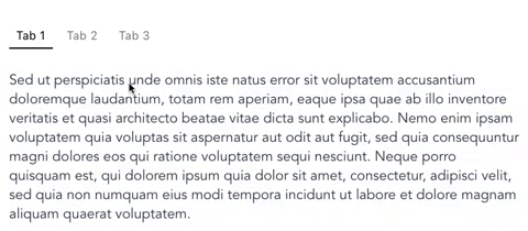
  <nav class="tabs">
    <button class="tabs__item tabs__item_active"> Tab 1 </button> <!-- active tab -->
    <button class="tabs__item"> Tab 2 </button>
    <button class="tabs__item"> Tab 3 </button>

    <div class="tabs__active-line"></div>
  </nav>
Finally, add some styles for component elements:
.tabs- component wrapper.tabs__item- button.tabs__item_active- active button.tabs__active-line- bottom line
Be sure to add position: relative; for .tabs class
and position: absolute; with bottom, left, height, background-color properties for .tabs__active-line class
CSS EXAMPLE
.tabs {
  position: relative;
  margin: 0 auto;
}

.tabs__item {
  display: inline-block;
  margin: 0 5px;
  padding: 10px;
  padding-bottom: 8px;
  font-size: 16px;
  letter-spacing: 0.8px;
  color: gray;
  text-decoration: none;
  border: none;
  background-color: transparent;
  border-bottom: 2px solid transparent;
  cursor: pointer;
  transition: all 0.25s;
}

.tabs__item_active {
  color: black;
}

.tabs__item:hover {
  border-bottom: 2px solid gray;
  color: black;
}

.tabs__item:focus {
  outline: none;
  border-bottom: 2px solid gray;
  color: black;
}

.tabs__item:first-child {
  margin-left: 0;
}

.tabs__item:last-child {
  margin-right: 0;
}

.tabs__active-line {
  position: absolute;
  bottom: 0;
  left: 0;
  height: 2px;
  background-color: black;
  transition: transform 0.4s ease, width 0.4s ease;
}
SCSS Example
.tabs {
  position: relative;
  margin: 0 auto;

  &__active-line {
    position: absolute;
    bottom: 0;
    left: 0;
    height: 2px;
    background-color: black;
    transition: transform 0.4s ease, width 0.4s ease;
  }

  &__item {
    display: inline-block;
    margin: 0 5px;
    padding: 10px;
    padding-bottom: 8px;
    font-size: 16px;
    letter-spacing: 0.8px;
    color: gray;
    text-decoration: none;
    border: none;
    background-color: transparent;
    border-bottom: 2px solid transparent;
    cursor: pointer;
    transition: all 0.25s;

    &_active {
      color: black;
    }

    &:hover {
      border-bottom: 2px solid gray;
      color: black;
    }

    &:focus {
      outline: none;
      border-bottom: 2px solid gray;
      color: black;
    }

    &:first-child {
      margin-left: 0;
    }

    &:last-child {
      margin-right: 0;
    }
  }
}| props | type | required | description |
|---|---|---|---|
| tabs | Array |
true |
description |
| currentTab | String |
true |
Active tab value |
| onClick | Function |
true |
Returns new tab value when clicked |
| updated | Boolean/String/Array |
false |
Props for custom update active line |
| wrapperClass | String |
false |
Custom class for container |
| tabClass | String |
false |
Custom class for tab item |
| tabActiveClass | String |
false |
Custom class for active tab item |
| lineClass | String |
false |
Custom class for active line |
type: Array, required: true
The array must contain objects with the following properties:
-
title- required, typestring. Title of tab -
value- required, typestring. Value of tab -
disabled- optional, typeboolean. Disabled attribute
- Clone repository:
git clone [email protected]:karambafe/vue-tabs-with-active-line.git - Install cli-service-global:
npm install -g @vue/cli-service-globalVue CLI 3 docs - Run any vue file with hot reload and static server:
vue serve demo-src/App.vue
- Fork it!
- Create your feature branch:
git checkout -b my-new-feature - Commit your changes:
git commit -am 'Add some feature' - Push to the branch:
git push origin my-new-feature - Submit a pull request :D
This project is licensed under the MIT license, Copyright (c) 2018 karambafe. For more information see LICENSE.