3796 fix dependencies modal theme #3865
Conversation
|
Build for latest commit 4d61a47 is at https://pr3865.build.csb.dev/s/new. |
|
Thanks for this PR!! This looks very good visually, the only thing I notice is the border around the modal, would it be possible to remove that? |
|
|
||
| return ( | ||
| <ThemeProvider theme={localState.theme.vscodeTheme}> | ||
| <ThemeProvider theme={localState.theme}> |
There was a problem hiding this comment.
We need to make sure this doesn't break any modals other than the Search modal.
I think we have styles for that in the polyfill, can take it from here 👍 |
|
@siddharthkp The @tanmoyopenroot This change also breaks opening the delete modal (both in a forked sandbox and on your dashboard). |
I will try to fix it without breaking any other modals. |
I will fix it by using |
|
@tanmoyopenroot Would you be open to pair program on this bug? I can explain what we do in the |
Sure |
|
@tanmoyopenroot 👍 sent you an invite for slack |
|
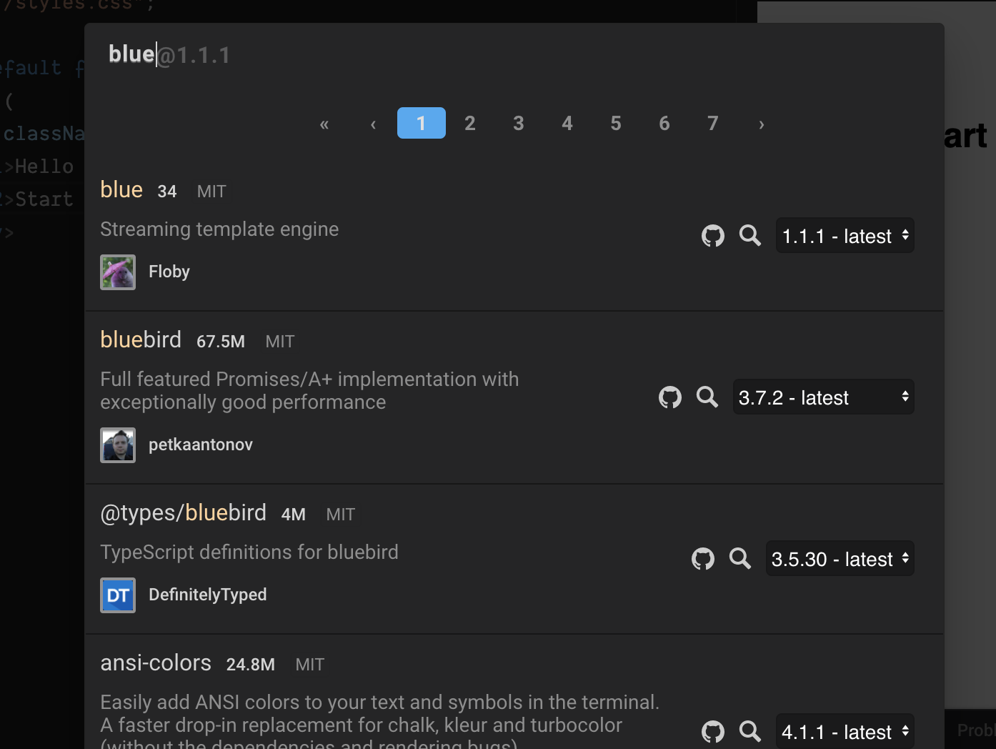
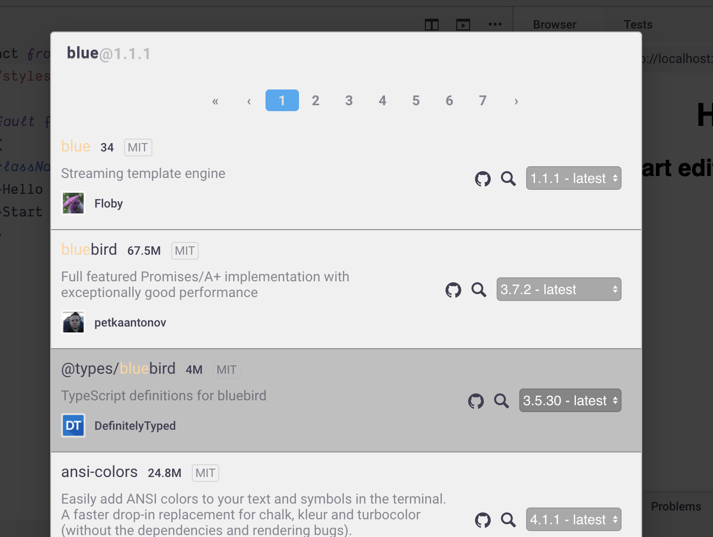
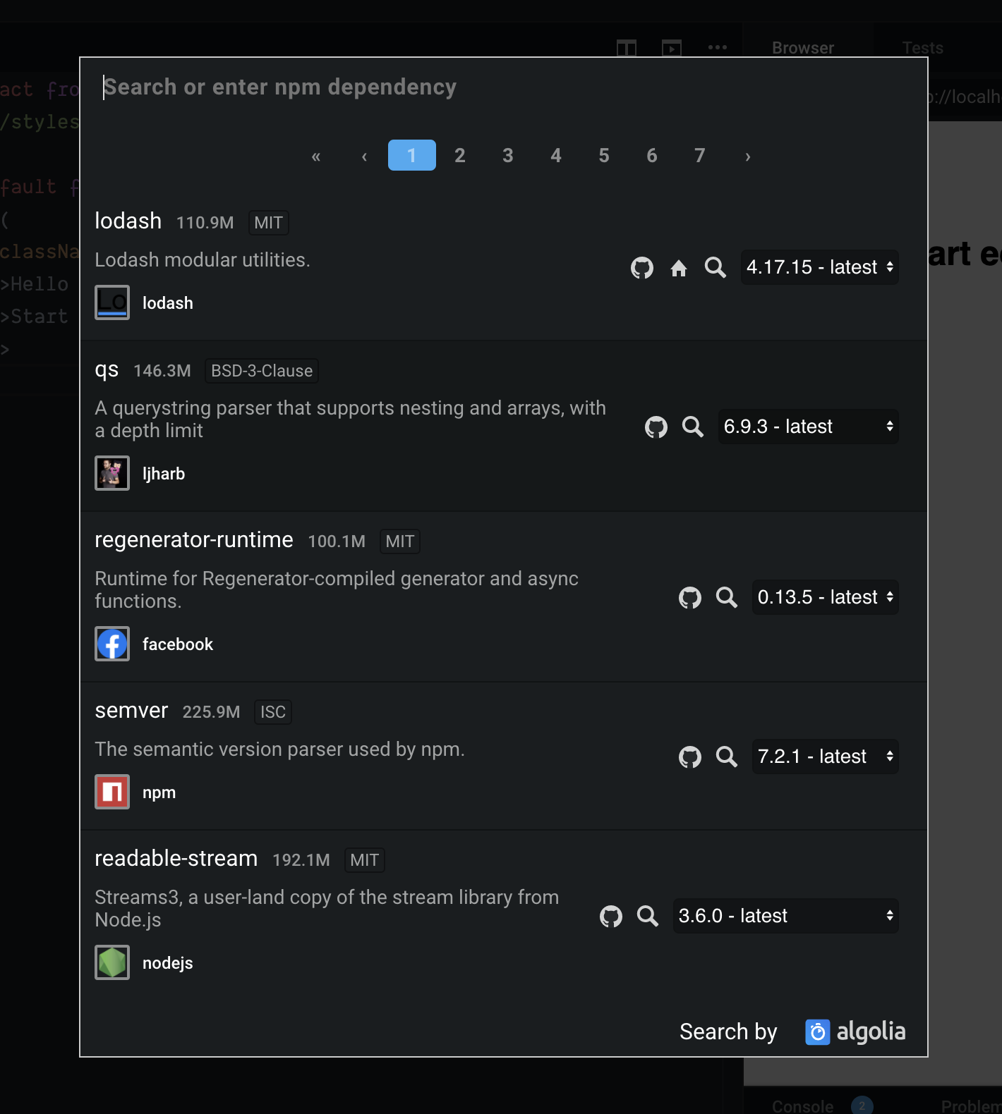
Dark Theme Light Theme |
| .ais-Highlight-highlighted { | ||
| color: ${props => props.theme['button.hoverBackground']}; | ||
| color: ${props => props.theme['button.hoverBackground']}; |
There was a problem hiding this comment.
How about using button.background. Currently, the highlighted text isn't visible properly in the light theme. And button.background goes in contrast with the background. Check the below screenshot:
Note: First suggestion is current styling and second suggestion is updated styling
Light Theme:
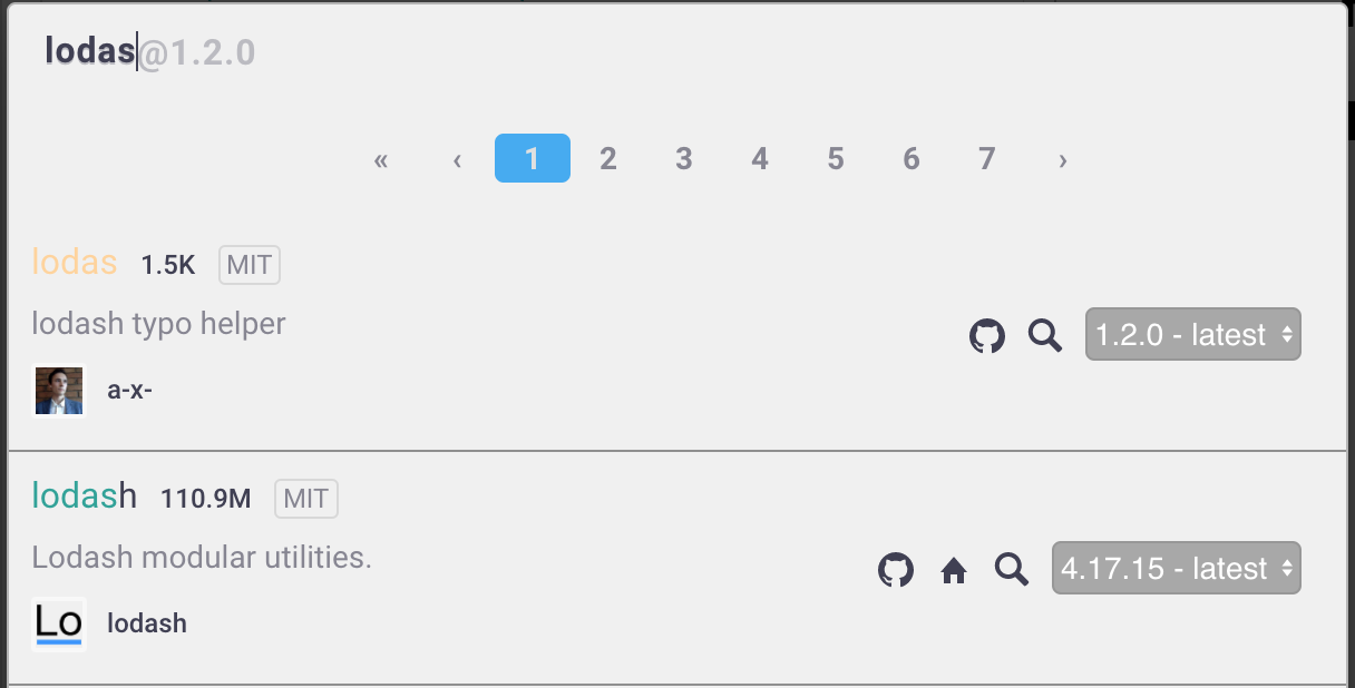
Dark theme:
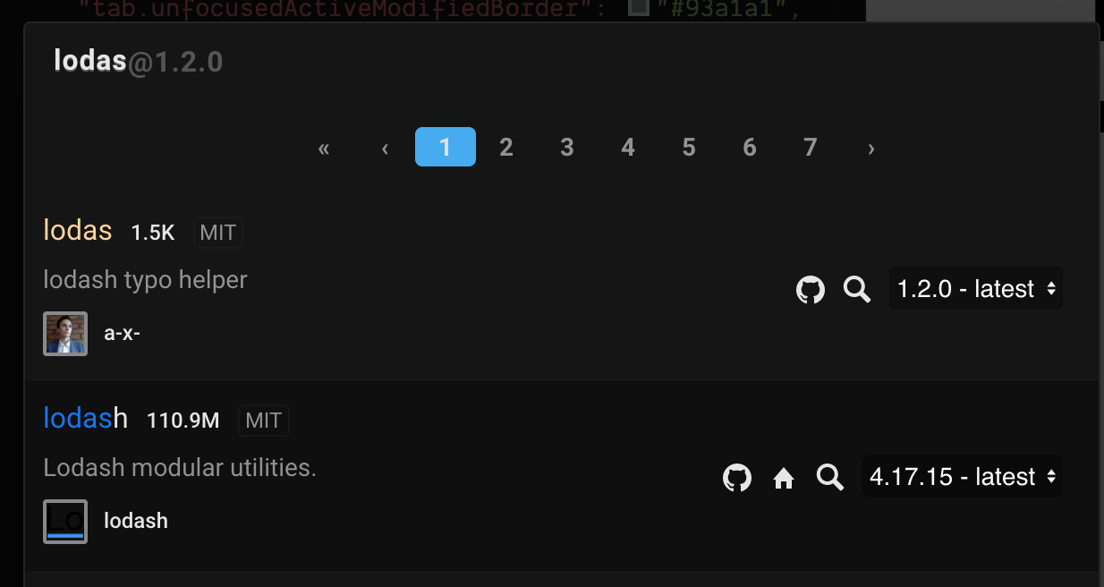
Thoughts ?
There was a problem hiding this comment.
I and @siddharthkp had the same the discussion about the highlighted text issue.
And after using button.background the highlighted are visible now.
There was a problem hiding this comment.
I will make the changes and push it.
There was a problem hiding this comment.
👋
short: this works,  !
!
I'd recommend using and to create a difference between highlighted text and normal text.
It's hard to make this modal to match the redesign of the editor without redesigning the parts of the modal with @codesandbox/components.
That's not something that should block this improvement though! I'd recommend merging this PR and continue the work which might take slightly longer to finish
6 participants
What kind of change does this PR introduce?
Bug fix #3796
What is the current behavior?
On changing to light theme
Add dependenciesmodal doesn't pick up thelightthemeWhat is the new behavior?
On Changing to
lightordarktheme appropriate colors are added toAdd dependenciesmodalWhat steps did you take to test this? This is required before we can merge, make sure to test the flow you've updated.
The testing was done visually.
lightordarktheme fromColor ThemeunderPreferencesAdd dependencyinExplorer tabAdd dependenciesmodalLight Theme
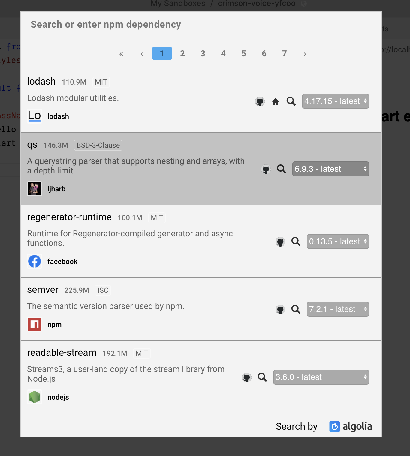
Dark Theme
Checklist