Skip to content

Conversation

@sgratzl
Copy link
Member

@sgratzl sgratzl commented May 7, 2021

based on #930

adds a new section to the indicator status overview page about the backfill profile of the selected indicator:

image

https://deploy-preview-931--cmu-delphi-covidcast.netlify.app/indicator-status/#change_b

@netlify
Copy link

netlify bot commented May 7, 2021

Preview link ready!

Built with commit ee9f0a2

https://deploy-preview-931--cmu-delphi-covidcast.netlify.app

@sgratzl
Copy link
Member Author

sgratzl commented May 7, 2021

@sgratzl sgratzl changed the title WIP: backfil profiling viz WIP: backfill profiling viz May 7, 2021
@sgratzl sgratzl changed the title WIP: backfill profiling viz backfill profiling viz May 10, 2021
@sgratzl sgratzl self-assigned this May 10, 2021
@sgratzl sgratzl added the enhancement New feature or request label May 10, 2021
@sgratzl sgratzl marked this pull request as ready for review May 10, 2021 16:05
@sgratzl sgratzl requested a review from krivard May 10, 2021 16:26
@krivard
Copy link
Contributor

krivard commented May 10, 2021

  • Irregular left margin on input labels
    image

  • Arrows might be too close to edge of input? i might just be hypersensitive this morning
    image

@sgratzl
Copy link
Member Author

sgratzl commented May 19, 2021

The location is now indeed remembered in the "Backfill Profile" tab, but the signal does not appear to be preserved, nor to transfer back-and-forth between the two tabs.

now I understand what you meant, should be fixed.

@sgratzl
Copy link
Member Author

sgratzl commented May 19, 2021

@RoniRos
Copy link
Member

RoniRos commented May 19, 2021

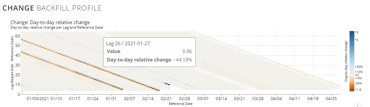
I like your idea of clamping the scale, maybe to 2 or 3? If the value changes day to day by a factor of more than 3, it probably doesn't matter by how much it changes.

However I think the scale should be symmetric in the log domain: the equivalent of a bump up by a factor of 2 is a bump down by a factor of 2. If you clamp the bump up at 3, let's clamp the bump down at 1/3. For legibility, the tickmarks should probably be labeled in the original domain, namely something like (*1/3+ ,*1/2, -30%, -20%, -10%, NC, +10%, +20%, +30%, *2, *3+). I realize these are not exactly symmetric, and that the notation can be improved, but hopefully the gist is clear: we want to see small changes, which we usually think of as +/-X%, and we want to know when the changes become so big that they change the order of magnitude.

@RoniRos
Copy link
Member

RoniRos commented May 19, 2021

the heatmap still goes only to 60 or 65.

the anchor lag so far can be interpreted as: the last lag/issue that has a lag <= anchor lag

For example, consider the following two dates and their available lags:
2021-01-01 has issues with lags: 4, 6, 10, 12, 34
2021-01-02 has issues with lags: 4, 5, 11, 33

let's assume anchor lag =12.
For 2021-01-01 it will pick 12 and for 2021-01-02 it will pick 11, since both both represent the issues that would be valid at a lag of 12.

The blue anchor line in the heatmap shows which anchor / lag has been used for this specific date. In your example, you requested that you wanna use an anchor of at most 90. However, the data only has issues with a maximal lag of 60 to 65 (see comment form Katie). Thus, those were picked as the anchor lag.

In general, I'd like to move away from the concept of 'issue', and think only in terms of 'as-of'. Issues are a special case of as-of, when revisions to all locations are expected at regular intervals. Issues made sense when we started tracking well-regulated CDC web reports, but quickly stopped making sense when you get sporadic updates to sporadic locations.

More importantly, the shift to as-of clarifies that there is an 'as-of' value for every signal and every location on every day, even if there was no update ("issue") released on that day. The as-of value is the most recently reported value up thru that day. So in your example above, if the requested anchor lag is 12, for ref=2021-01-02 the as-of value at lag 12 will be the same as its value at lag 11.

@sgratzl
Copy link
Member Author

sgratzl commented May 19, 2021

However I think the scale should be symmetric in the log domain: the equivalent of a bump up by a factor of 2 is a bump down by a factor of 2. If you clamp the bump up at 3, let's clamp the bump down at 1/3. For legibility, the tickmarks should probably be labeled in the original domain, namely something like (*1/3+ ,*1/2, -30%, -20%, -10%, NC, +10%, +20%, +30%, *2, *3+). I realize these are not exactly symmetric, and that the notation can be improved, but hopefully the gist is clear: we want to see small changes, which we usually think of as +/-X%, and we want to know when the changes become so big that they change the order of magnitude.

re scale: the charting library has some limitations but I tried to achieve what you described:

image

@RoniRos
Copy link
Member

RoniRos commented May 19, 2021

However I think the scale should be symmetric in the log domain: the equivalent of a bump up by a factor of 2 is a bump down by a factor of 2. If you clamp the bump up at 3, let's clamp the bump down at 1/3. For legibility, the tickmarks should probably be labeled in the original domain, namely something like (*1/3+ ,*1/2, -30%, -20%, -10%, NC, +10%, +20%, +30%, *2, *3+). I realize these are not exactly symmetric, and that the notation can be improved, but hopefully the gist is clear: we want to see small changes, which we usually think of as +/-X%, and we want to know when the changes become so big that they change the order of magnitude.

re scale: the charting library has some limitations but I tried to achieve what you described:

image

Looks good!

  • The "NC" (no change, alternative notation welcome) should be easily distinguished from small changes, because it usually corresponds to no updates, which is important to know. Ideally, it would be represented by white. Is this already the case? Namely, is "NC" represented by a distinct white, easily distinguishable from e.g. +/- 3% ?

  • Re the majority color (greyish brown?), am I correct in assuming that these are mostly "down" corrections? Or is it the color of "NC"? Ideally, it should be easy to see when there are "down" and when there are "up" corrections. If it's not clear, we may want to clamp at (1/2, 2) and stretch the colors a bit.

  • is there a good way to indicate that the edges of the color legend are clamped, namely that "*3" is actually "times 3 or more", and "*1/3" is actually "divided by 3 or more"? Also 1/3 might be easier to mentally parse if rendered as proper fractions (\frac{1}{3}).

@sgratzl
Copy link
Member Author

sgratzl commented May 20, 2021

I switched to this color scale: https://github.com/d3/d3-scale-chromatic#interpolateRdBu and added the white = 0 as suggested. Those color scales are designed that the values around 0 have some neutral color, since small changes around 0 might be the result of numeric errors.

image

@RoniRos
Copy link
Member

RoniRos commented May 20, 2021

I switched to this color scale: https://github.com/d3/d3-scale-chromatic#interpolateRdBu and added the white = 0 as suggested. Those color scales are designed that the values around 0 have some neutral color, since small changes around 0 might be the result of numeric errors.

image

I like this! Thank you!

@RoniRos
Copy link
Member

RoniRos commented May 21, 2021

  • In "Fraction of value at lag 60" mode, report dates that didn't have issues (e.g. 5/9 in New York Change) show as white. Shouldn't they show the column to their left (values of the previous report date), based on our definition of 'as-of', which is cumulative?
  • "Fraction of value at lag __" can easily exceed 1.0, and in fact it often does. Right now you are clamping the color scale at 1.0 . I think we should clamp it at higher than 1, preferably based on the data (say at the 95% quantile?), otherwise at some compromise value (e.g. 1.25). Also, it might make sense to use a color scale that shows qualitatively which values are above 1.0 vs. which are below.

@sgratzl
Copy link
Member Author

sgratzl commented May 21, 2021

* "Fraction of value at lag __" can easily exceed 1.0, and in fact it often does.  Right now you are clamping the color scale at 1.0 .  I think we should clamp it at higher than 1, preferably based on the data (say at the 95% quantile?), otherwise at some compromise value (e.g. 1.25).  Also, it might make sense to use a color scale that shows qualitatively which values are above 1.0 vs. which are below.

e.g.

image

@sgratzl
Copy link
Member Author

sgratzl commented May 21, 2021

* In "Fraction of value at lag 60" mode, report dates that didn't have issues (e.g. 5/9 in New York Change) show as white.  Shouldn't they show the column to their left (values of the previous report date), based on our definition of 'as-of', which is cumulative?

I would keep them in a white/missing color, since e.g.,

image

gives you a nice idea, when no issues were triggered, e.g. because of some outtake in the pipeline)

@krivard
Copy link
Contributor

krivard commented May 21, 2021

@RoniRos this has been great feedback! I'd like to release these next week. We can always patch changes to the color maps later; do you have any dealbreakers that must be fixed before the first release?

@sgratzl
Copy link
Member Author

sgratzl commented Jun 10, 2021

@RoniRos this has been great feedback! I'd like to release these next week. We can always patch changes to the color maps later; do you have any dealbreakers that must be fixed before the first release?

ping

@RoniRos
Copy link
Member

RoniRos commented Jun 10, 2021

Sorry, I thought we communicated on this in another channels (comments on a googledoc?) Anyway, I agree we should release ASAP! My understanding was that the only release-blocking potential issue was the signal naming. Is it finalized (or at least finalized enough)? Is it waiting for me?

@krivard
Copy link
Contributor

krivard commented Jun 10, 2021

I believe we are switching to the UI organization proposed in indicator-status-backfill-names before release.

@sgratzl if you want to merge this as-is to unblock other work, then do the UI organization in a separate PR, that's fine.

@sgratzl
Copy link
Member Author

sgratzl commented Jun 11, 2021

I prefer changing one thing at a time, so let's merge and alter it later

@sgratzl sgratzl merged commit 29079cd into dev Jun 11, 2021
@sgratzl sgratzl deleted the sgratzl/backfill2 branch June 11, 2021 14:03
@krivard krivard mentioned this pull request Jun 16, 2021
Sign up for free to join this conversation on GitHub. Already have an account? Sign in to comment

Labels

enhancement New feature or request

Projects

None yet

Development

Successfully merging this pull request may close these issues.

4 participants