Clean up the design #506
Description
-
Get rid of Lato
-
Either change the direction of the vertical shadow between the left sidebar & content, or make it a solid gray line?
-
Add spacing to the bottom of the left sidebar to avoid this:
- Fix the dropdown at 1000px wide
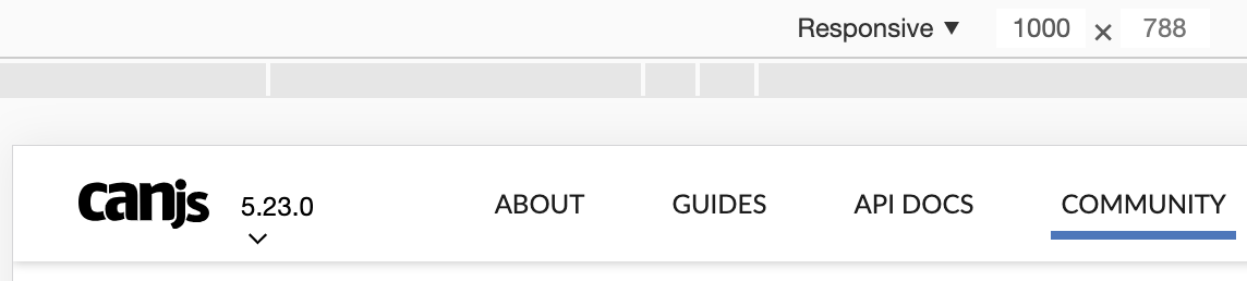
- Vertical alignment: make the logo, version, & links share the same baseline? [And same thing with the other stuff in the nav?]

-
Horizontal alignment: tighten the space between the main nav links, use padding instead of margin so the link target area is bigger, & make the spacing between things more cohesive (right now it’s 30px | logo | 15px | version | 60px | nav links on the left and search input | 20px | By Bitovi | 10px on the right)
-
Make comps for what the “By Bitovi” logo would look like with black text (just By black, By gray and Bitovi black, & both black)
-
The X in the search input feels huge to me but it looks like it’s the same size as the magnifying glass. Maybe consider making it smaller, or less thick, or…?
-
Consider how we could make the hover & selected states more consistent