feat: add simpler API for controlling overlays #422
Conversation
 cuberoot
force-pushed
the
cuberoot/overlay-refactor
branch
3 times, most recently
from
cuberoot
force-pushed
the
cuberoot/overlay-refactor
branch
3 times, most recently
from
a63c2ff to
6a0c516
Compare
| } | ||
|
|
||
| export class OverlayStack { | ||
| public overlays: ActiveOverlay[] = []; |
There was a problem hiding this comment.
We can just use the DOM as our data structure. Follow the DRY principle and get rid of this.
| /** | ||
| * This class allows access to the overlay system which allows a client to | ||
| * position an element in the overlay positioned relative to another node. | ||
| */ |
There was a problem hiding this comment.
This class can be used from other components
The current implementation uses events to open and close overlays. This would be hard for users to adopt and is not easy to use in our other components that need overlay behaviour.

This change refactors how our overlays are opened and closed to address issue #321.
cuberoot
force-pushed
the
cuberoot/overlay-refactor
branch
from
6a0c516 to
e3b1ff2
Compare
There was a problem hiding this comment.
I really like the internal changes to overlay-trigger here. Much nicer!
It's a lot of code, and a bunch of concepts that are still pretty new to me, so I'm gonna take another pass on the code later, but had the following thoughts to share...
I'm not sure how I feel about manually using the Overlay object myself in code a la packages/overlay/test/overlay.test.ts. The comfort line between declarative and imperative are always hard. To that end, I'd really like to see a declarative API in overlay-trigger that surfaced much the same functionality. I'm comfortable with that being addressed in a follow up PR, so if you want to hold off on that, can you create a ticket to track? I was looking into this sort of thing for #157 and it started to look like:
<overlay-trigger
    ?click-content-open
    ?hover-content-open
    @content-opened=${onContentOpened}
    @content-closed=${onContentClosed}
></overlay-trigger>
I'd be very happy to hear better API naming ideas, so tracking in an issue separately might make better sense.
|
|
||
| private placeholder?: Comment; | ||
| private root?: HTMLElement; | ||
| private root?: HTMLElement = document.body; |
There was a problem hiding this comment.
If we can have this set on the class, can we remove the ?? It would also allow us to remove
|
|
||
| this.onChange(this.overlays); | ||
| const activeOverlay = ActiveOverlay.create(details); | ||
| document.body.appendChild(activeOverlay); |
There was a problem hiding this comment.
With the structural changes herein, if I wanted to make the "overlay root" element flexible, where would you see adding that? Having this as a static on Overlay makes me feel like it's a little fixed, but I don't use a lot of statics in my code to be fully aware of the possibilities they afford.
The issue this supports is something that is currently in Crisp where we don't actually use sp-theme to set our styles, as previously there was no way to use it with only some of the styles. The answer may simply be for me to add the large styles to the sp-theme package, but an alternative would be to allow for our crisp-app element to be set for use in place of document.body here by sort sort of configuration.
There was a problem hiding this comment.
I too am a little concerned about not being able to control where we reparent overlays to.
The case I'm thinking of is a modal thats contained within an area of an application, in this case I want its z-index to be above the content in the containment area, but below content in other areas outside of the container. This seems natural to me to create an overlay root thats specifically for use by this modal, with the main document.body root being used for tooltips etc.
Is this a case this change supports? I think we may have even lost this capability before this change?
There was a problem hiding this comment.
This was a feature taken away when removing overlay-root, yes. I don't personally have a preference between needing it now vs the ability to easily refactor this functionality in later, which is why it was omitted previously when this wasn't a static.
@benjamind could you expand on:
The case I'm thinking of is a modal thats contained within an area of an application, in this case I want its z-index to be above the content in the containment area, but below content in other areas outside of the container.
Is this a case of a UI with multiple modals open at the same time, or something else? Would be a good use case to have clearly defined in the docs as a "possible" or "not possible" depending on how this comes together.
There was a problem hiding this comment.
The case I was thinking of was something like this:
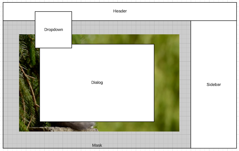
Where we have an area where we want a contained modal, this has a mask area behind the modal and a dialog with tooltips etc inside. This is one stack of overlays.
The application however supports dropdowns and tooltips that can potentially overlap this stack, but do so from outside of the contained area.
I've not delved too deeply into how our overlay stack works at this time, so I'm not sure how we support this today, especially with regards to resize of the masked area etc.
There was a problem hiding this comment.
So, our overlays stack globally in the order in which they are opened. I could see the dialog being an overlay itself. If you opened an overlay in the dialog (tooltip on hover, click popover, etc) it would open at a higher level than the dialog. If you opened a dropdown from the header, while the dialog was open (ignoring that it is supposed to be modal), the dropdown would appear over the dialog as you would expect.
A problem with explicitly restricting the overlay area to a subset of the view (e.g. the mask) is that we may restrict the positioning of something like a dropdown more than we need to. I don't know if that is something that we want?
So, I guess I am saying that I think we would get reasonable results in the scenario you have outlined without multiple levels of overlay root. I am not yet convinced that the added complexity is warranted. But, I could be convinced 😁
There was a problem hiding this comment.
Yeah I think I agree that our current code covers the case for the z-stacking issue.
The main concern I have is I think about responding to resize. Since the modal mask and the dialog would be centered within their container, but they are re-parented to document.body (or our overlay root), then I'm not quite sure how they would manage their resizing without having to have very explicit code to manage sizing the modal and dialog against their original container?
|
|
||
| this.onChange(this.overlays); | ||
| const activeOverlay = ActiveOverlay.create(details); | ||
| document.body.appendChild(activeOverlay); |
There was a problem hiding this comment.
I too am a little concerned about not being able to control where we reparent overlays to.
The case I'm thinking of is a modal thats contained within an area of an application, in this case I want its z-index to be above the content in the containment area, but below content in other areas outside of the container. This seems natural to me to create an overlay root thats specifically for use by this modal, with the main document.body root being used for tooltips etc.
Is this a case this change supports? I think we may have even lost this capability before this change?
|
@Westbrook I was aware of the need for a declarative API too. I was going to leave that for now, but I will go back and have a think about it now. |
|
As discussed offline (on Slack), I think I'd like to see the following changes to this PR:
const overlay = createOverlay(button, 'click', outerPopover, { delay: 0, placement: 'top', offset: 10,});
// sometime later
overlay.close();
We can defer |
|
@benjamind Do you want to extract the future work you want done into an issue and then we can close this? |
|
I'm honestly happy to close this, what we have today serves purpose and we can create new tickets for future work if we decide it needs revisiting then? |
|
Ok, shutting this one down! |
Description
The current implementation uses events to open and close overlays. This would be hard for users to adopt and is not easy to use in our other components that need overlay behaviour.
This change refactors how our overlays are opened and closed to address issue #321.
Related Issue
#321
Motivation and Context
This change puts us in a better place for incorporating overlay functionality into other components (such as #157).
How Has This Been Tested?
I have tested this in Storybook and have added more tests
Screenshots (if appropriate):
Types of changes
Checklist: