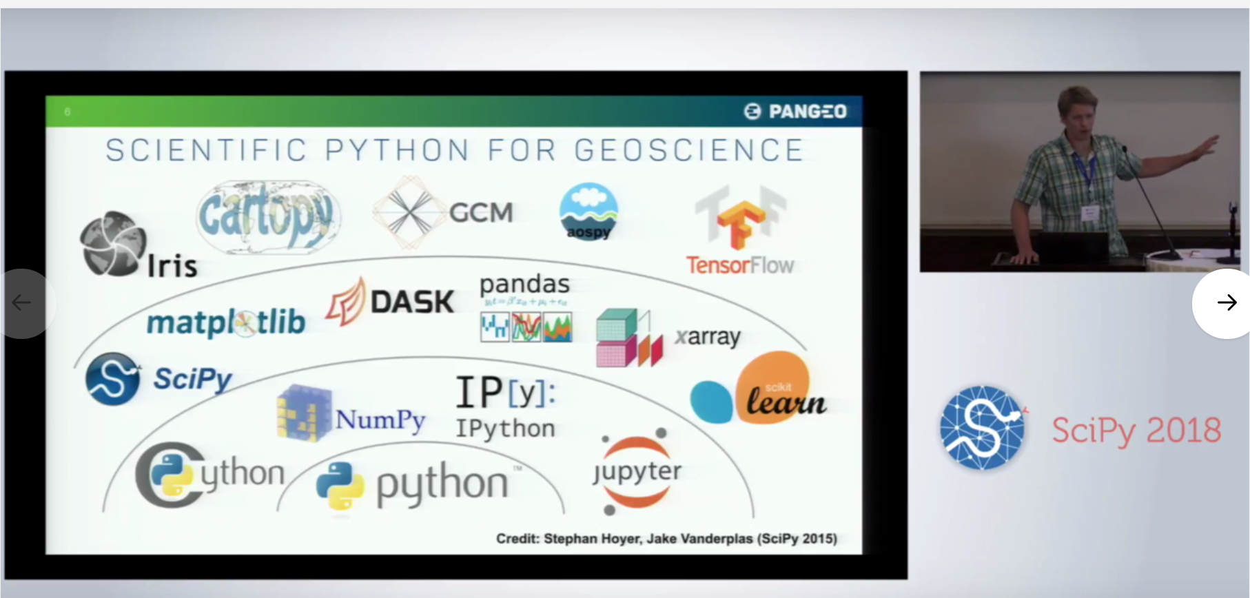
Colourised Logos #3002
Colourised Logos #3002
Conversation
This comment has been minimized.
This comment has been minimized.
|
Thanks for your first contribution @meganfitzsimons! 🎉 I've added both yourself and @niallrobinson to the contributors list so the CLA checker should start going green shortly. (The travis tests are a separate issue, which we have resolved on master - nothing for you to do on that from). I've marked this for "decision needed", simply because this is a subjective appearance change, and we really need to get some form of consensus about the design. Beyond just the logo, have you by any chance taken a look at the iris docs that might help the development team buy-in to the proposed changes? Essentially, I think we should probably have a broad vote using the reaction buttons (:+1: / :-1:) to the original PR description. For those who would like to vote, but who aren't yet decided, please vote with a :confused: - no guarantee that if there is clear consensus we will wait for all :confused: to become votes, but at least it gives an indication of who wants to be involved with the conversation. I'll start by placing my 😕 vote, as I'd love to see a bigger picture before moving forwards with specific logo changes. Thanks again @meganfitzsimons - and please don't take offence at my 😕, it is the only symbol we have that represents neither a a resounding yes or a resounding no! 😄 |
Do you mean more pixels or in context? The pixels are the same what was there before. |
Touché. In this instance, I mean where does this lead. My perspective is that colorising the logo is just the first of many things that need to be addressed in order to give iris a sense of modernity. I guess the point is, by itself, adding colour to the logo doesn't do that, therefore I'd personally need to have a sense of direction before we take the first step... |
@meganfitzsimons doesn't have time to do a full rebrand unfortunately. Can I invoke the "that is divisible and should be a separate PR" clause? We could view this as a fundamental change in iris branding - or we could just treat it as the same logo but with the implied colours on. |
|
hi avd - are we really going to block simply colouring in a logo because we'd rather someone did a full rebrand? |
|
Given that @pelson suggested a vote two months ago and we are currently at five 👍, two 😕 and zero 👎 I think the winner is to merge this. I agree with @niallrobinson that this is a minor (but very useful) enhancement to the existing branding, but we should also raise an issue to discuss a rebrand. |
This is incredibly subjective - please try to use language that reflects that. Also, please be respectful that Iris is not just a Met Office thing. People don't know what "avd" actually is, and excluding others who may want to be involved in the conversation is never a healthy thing. I've already stated my position. I frankly do not see a benefit to a logo change alone. I'm fine with iterating, but not iterating in a random direction. Given that the implication of the change is a chain reaction of pull requests and a non-zero amount of effort after merging this PR, I won't be merging this in the current state of discussion. Finally, please be aware that 2 of the 3 SciTools steering council members have raised 😕. This should be a clear indication that there isn't broad consensus, and that yes, there is more work to be done before this should be merged. That doesn't mean that "we" are "really going to block simply colouring in a logo because we'd rather someone did a full rebrand", but it does mean that some more effort is required to layout an agreed sense of direction before we start traveling. |
That's a fair point - sorry non-Met Office people.
Also fair enough, in which case I'll close this PR and we can always pick up the contribution if the broader discussion happens. Edit: looks like I can't close it actually |
|
I fully sympathise with your comments but still encourage you all to consider this change. As someone who spends a reasonable amount of time advocating iris I feel this would be very helpful to me. Out of curiosity what makes you say:
I'm not sure I follow the logic? |
|
I guess it triggers a bunch of website/document building, deploying and checking. |
That is OK, but to be clear, it isn't really the desired outcome for anybody. We do all want to see Iris improve its branding, and especially to improve the quality of its documentation, where layout and design have a big part to play. Don't know how much space you have to co-locate and thrash out some html / design concepts, but I'd be up for that - we'd still need to come back to GitHub to make the final agreement, but would certainly speed up the iteration. Closing on your behalf, but please don't see this as a closed book. |
|
Don't worry - I disagree about the value of the change (obviously - as per the discussion), but I completely understand not having the bandwidth to take it forward. Unfortunately we are in a similar position - we just thought that this would be a quick easy low-hanging-fruit win that we could contribute on the side. |
|
Re-opening this... I'm keen to bank the value of this change to the logo and make the associated minimal changes from that point to incorporate the logo elsewhere. We're slowing spinning up in the space of looking at an iris and scitools documentation refresh, and I see the logo change as a decent tangible catalyst for that change. |
|
Could not review pull request. It may be too large, or contain no reviewable changes. |
|
I'll drop them off on Friday
|
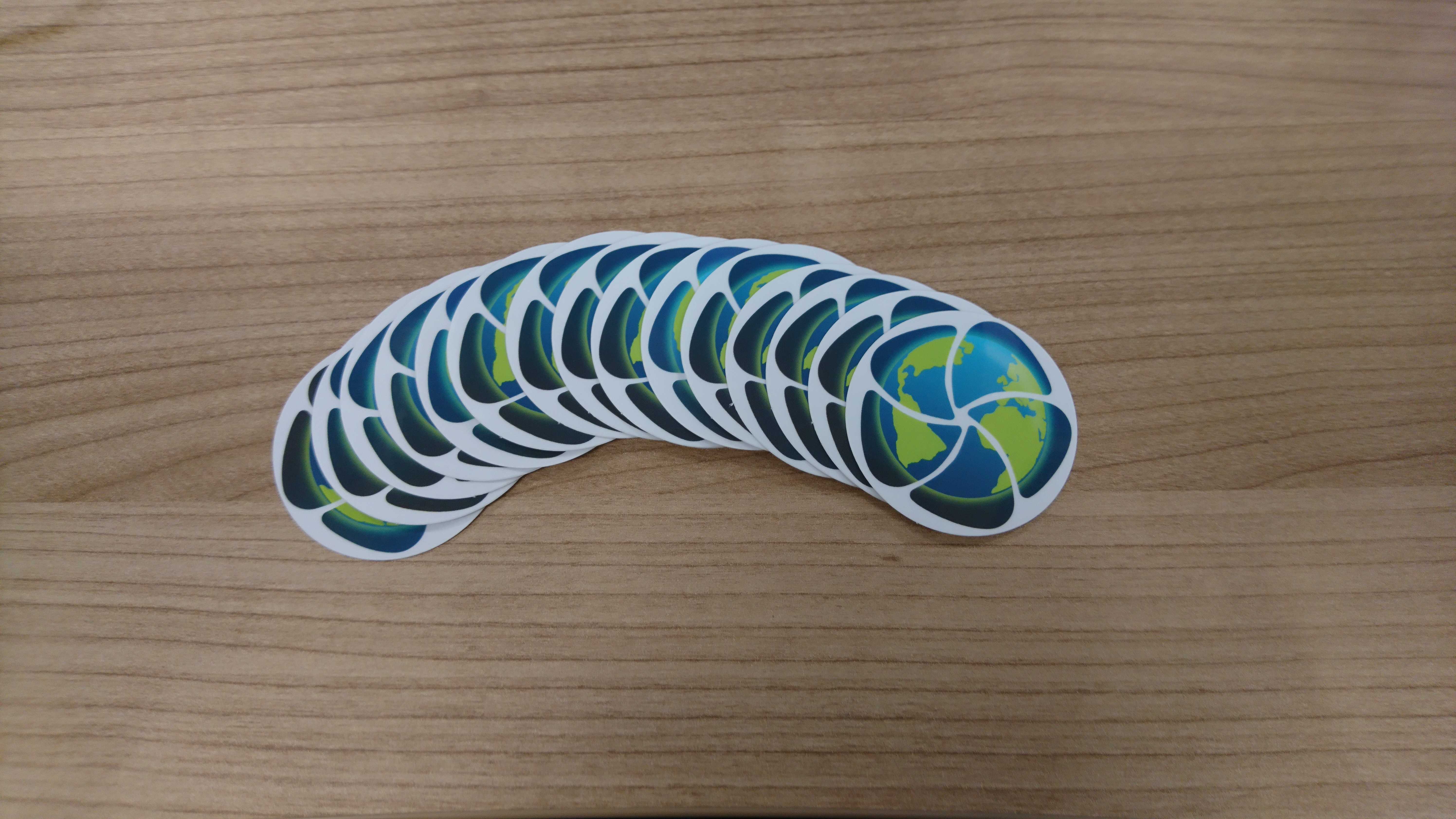
Colourised the two iris logos