Implement glucose schedule override (pre-meal/workout) in Watch App #658
Conversation
|
Thanks Michael, Here is a list of things to look into. I know it's a lot, and sorry for landing it in one dump. Let me know if you have any questions about them.
|
|
I checked in updated media files to the Assets repo. You don't need to rasterize them; I can hopefully get you some rasterized versions soon. |
|
Here's an image for reference regarding the comments above about rendering issues: |
Sorry about that--I should've waited to get those assets from you instead of attempting to fiddle with the tab bar icon PDFs. I noticed these flaws as well and should've omitted the images altogether rather than using poorer versions as placeholders. This PR simply uses the carb/bolus images for the override buttons. These will be replaced once the rasterized icons are prepared. (I'd be happy to learn how this is done, but at the moment it's not something I have experienced with.)
No longer an issue due to the change in design.
Upon receiving a Watch context, the Watch app now verifies that the current date is between the start and end dates before updating the UI for the override context. There's one edge case here when the user enables a timed override via the main app (e.g. 1 hour workout mode) in that the Watch app won't reflect the timeout of this override until another Watch context is delivered. However, this parallels the way the main app updates the UI in response to the timeout of this override (i.e. not until StatusTableViewController calls reloadData, typically in response to a loop being run). Since the main app and the Watch should be in sync and the update will occur after the next loop is run (at the latest), I don't think this is a significant issue.
A Watch app override button will now be grayed out if no target is configured for that context. In addition, an updated Watch context is sent if the user implements or removes a range for an override context, so the buttons' disabled states are updated accordingly.
The buttons now invert colors to reflect the selected state. This required a small tweak to the 'dark' colors, which previously relied on using a color with a lower alpha value on top of a black background. The label text remains white regardless of state.
Implemented.
To ensure the Watch app UI updates appropriately, an error will be thrown if the Watch is unreachable rather than transfering the user info.
Implemented.
Implemented.
I've cleaned up the way I handle optionals, particularly when rawValues are involved. This revision should be much more readable.
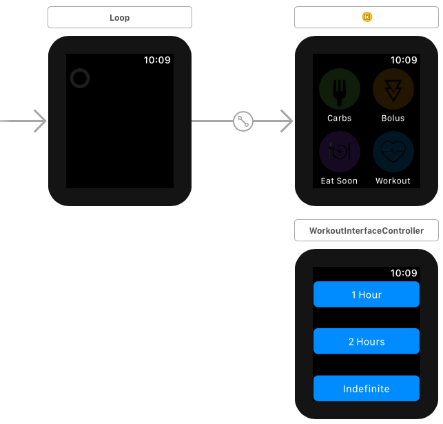
Yep, you're definitely right. Committing to paging would require WKPanGestureRecognizer. To be honest, I actually forgot that Watch apps get (what's basically) a scroll view for free. I've placed the override buttons just off screen below the carb/bolus buttons. The Interface storyboard doesn't reflect the spacing accurately, which I spent some time trying to figure out, but the layout is correct at runtime. One advantaging of a paging system is that the page dots make clear that more functionality is available to the user. As it stands, watchOS provides no visual indicator of additional content on an active interface controller until the user begins scrolling, which they wouldn't necessarily know to do. This just means it will be worthwhile to make a note of the existence of this feature once it's fully implemented, as it may otherwise be invisible to users who are accustomed to the current interface. (Having the additional buttons "peek" out from the bottom of the screen would make it obvious, but the interface wouldn't be as clean.) |
|
Thanks for your guidance as always, Pete--I really learn a lot from your feedback. Let me know if there are any other revisions you'd like me to make. |
|
Michael, I see your well down the path with the scrolling interface. I use the watch as my primary loop interface, and have found that keeping the Bolus and Carb entry on the main watch app display can cause them to activate due to unintentional bumping which has at times activated the bolus delivery screen. What I have done to ameliorate this issue was simply moved them to a separate interface controller, and use the builtin paging in watchOS to keep them off the main screen. I also added an Interface controller for setting the workout mode to 1Hr 2Hr and Indefinite.
I haven't wired up the context and figured your well down that rabbit hole. If your interested I've put my code here. https://github.com/jlucasvt/Loop/tree/temp-targets-on-watchface |
Minor nitsremove the stray print() statement Race conditions
The user scenario is not uncommon – "what does this button do? tap. tap."
...and that assumes that the messages remain in a serial order, which can't be assumed. The truth needs to be what the user last tapped, and only if that last tap fails does the UI need to reset. The watch needs to track this state explicitly. |
|
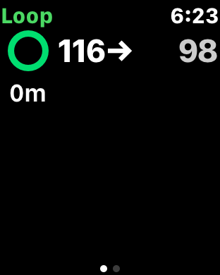
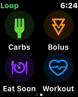
Here are the updated rasterized images: |
|
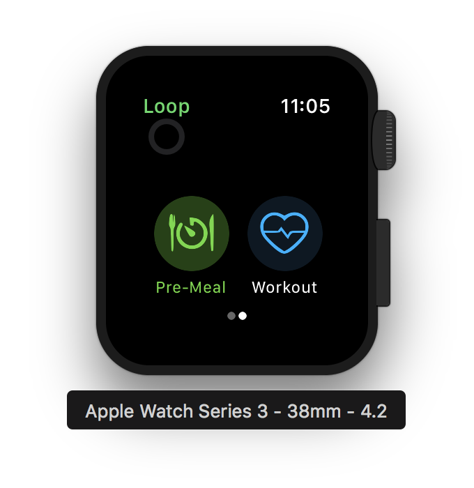
Implemented—restoring the UI to its previous state in response to an error is much more intuitive than sending the updated override back to the Watch from the phone in order to update. The new icons look the appropriate scale on the 38mm model, but the carbs and pre-meal icons look small by comparison to the bolus and workout icons on the 42mm model. This is odd to me considering the image sizes are scaled by the same factor. Since Watch UI elements lack an equivalent of UIViewContentMode, I think those two icons may need to be adjusted. |
|
@jlucasvt Thanks for your feedback! I think for the Watch interface it's sufficient for the workout mode button to toggle the setting for an indefinite time period, as it keeps the UI simpler. (Although if @ps2 disagrees, it's pretty straightforward to implement a controller like the mockup you included to enable control over the duration, and I'd be happy to do so.) Moving the buttons to a separate page would leave a lot of open space on the initial screen, and an extra swipe would be required to access the main Watch app functionality. I'm not convinced that this is a worthy change to make. |
|
Looks great! Thanks! |
|
Just to add: I think this addition is fantastic - thanks for implementing. I hadn't realized that the initial design was with pages; I've been monkeying with the app and trying to understand the code (my knowledge of swift is basic at best) to try and put this functionality in myself. Like @jlucasvt , I found that having the 'eating soon' and 'workout mode' buttons on page 2 to be a bit more convenient for me. In terms of the "unused space" -- I think it would be ideal to add current basal rate and IOB to the watch app as well, on the main page, just to provide the user with more information. For consideration! |
|
@apabari - I just put in a PR to display IOB and COB on the watch face. Hope to take a look at displaying current basal next, though I'm not sure how quickly I'll get to that. See my dev branch if you want to test. @mpangburn - regarding the discussions about a one vs. two page interface a la the layout from @jlucasvt, I've been think about this, too, and it occurs to me that a split of informational vs. functional pages could make sense. I use the watch for information much more often than for button pressing, so I could see a lot of utility in using the remainder of the first page for basal info plus even perhaps a BG graph or basal change graph, then moving all the buttons to page 2. |
Implementation for #657.
Summary: