Add Uninstall Button #1419
Add Uninstall Button #1419
Conversation
 onesounds
commented
onesounds
commented
Sep 27, 2022
- works like install button. (automatically change the query to pm uninstall ...)
| if (e.ChangedButton == MouseButton.Left) | ||
| { | ||
| var id = viewModel.SelectedPlugin.PluginPair.Metadata.Name; | ||
| var pluginsManagerPlugin = PluginManager.GetPluginForId("9f8f9b14-2518-4907-b211-35ab6290dee7"); |
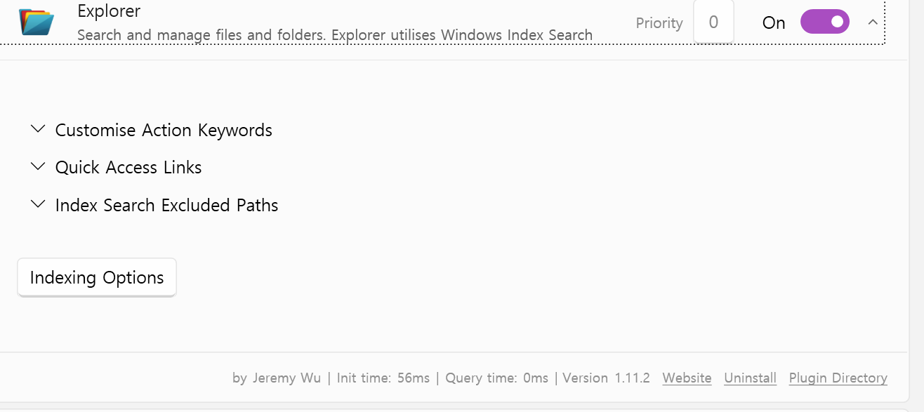
I don't want to nag 😅 but that looks like an enable and disable button to me, not a delete button (which completely removes the plugin from the storage and all its files and settings and whatnot). I could be mistaken, but users will visually think this is just a enable and disable button. Which is okay for now I guess. I hope my feedback is polite and not taken as hostility but rather friendly feedback 😅 Edit: I also see there is a link on the bottom right and that looks more like a delete button. But it's strange because that's a link. The delete button should be like the "Indexing Options" button and red. That's basic UX design. (A delete button should be completely red with white text or white with red text, just like GitHub does and other tech companies). |
|
OK. let me tell ya.
As you checked, the one at the top is the on/off button. Not install/uninstall.
Using red is not a good choice. This area is a setting panel and has a high priority for plug-in settings. Clearing plug-ins is relatively low in functional priorities. We should not emphasize items of low priority. and The reason why it is red is emphasized in the sense that it should not be pressed recklessly. My design is induces 'not to be pressed' through an inconspicuous form. If I put this in red, I'm sure everyone, including you, will find this strange.
The reason why it is not a button is the same. It is not suitable for the design of this area unless it is in the form of a text button, and I don't think this function is used or important enough to harm this design. Can you suggest a suitable design location elsewhere? I couldn't find a proper location other than that. If this is the same type as a post, it is right that the delete button appears in red, but it is more like a program than a post. Imagine a WordPress plug-in. The uninstall button is not on the self-setting panel. There should be a separate menu. We can also put uninstall next to the install button. However, in this case, it becomes inconvenient to find the plug-in installed. This is because it is normal to find the plug-in installed in the plug-in, not in the store. In addition, it is judged that there is no manpower enough to separate it into a separate menu. and there is no need to do so. It was originally a function used as a command. I don't think this is the right design either. But putting in red or button is even more incorrect. It's always good to give an opinion, and I feel that your question is worth answering. However, I want you to think about why we worked like this. I had to fight an awful lot of design battles in this repo. The version you're currently looking at is the result of my long, long design description. I have project manager experience in UI/UX of several large commercial projects. I'm not saying my judgment is right, but I know that if I get all the feedback, the design will be ruined. I try not to compromise as much as possible on the part that destroys the design. I respect the fact that you felt uncomfortable because there was no uninstall button. But I did this because I don't think your suggestion is right for design. I try to make this explanation at every proposal, but it is not perfect and uses a lot of time. I believe you will understand that you have experience with open source. Sadly, Everyone is fed up with the speed of progress and moves on to the fluent search github. 😂 Try the version before I work here. This was the original form of the program, and it was the application of many people's suggestions. You'll feel like I'm right, too. 😋 |
Thank you so much for your explanation. Yeah, you're right that sometimes you get too much feedback or too many people want it this or that way lol 😅 Don't mind me. I agree with a lot of things you said. I will check what I can do next week or after my exams. |